Branding
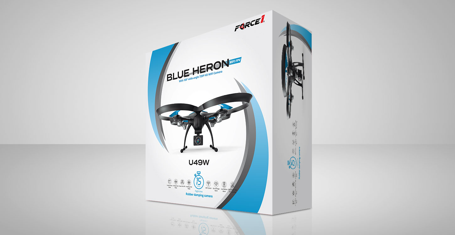
A Top Selling RC Brand
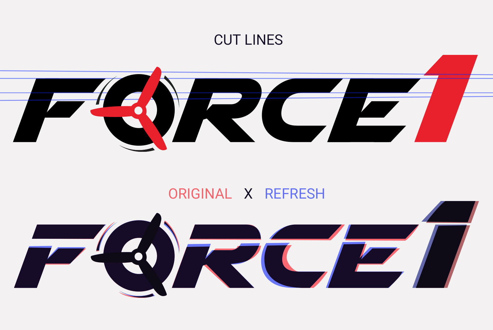
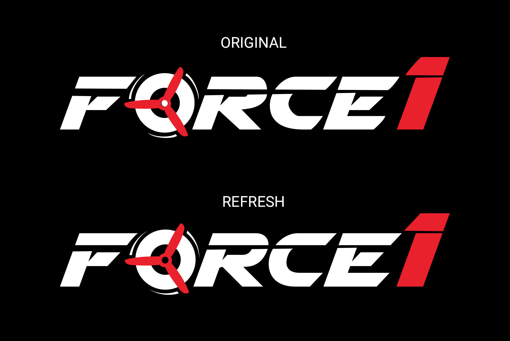
In late 2017, I put the Force1 logo under the microscope for some fine-tuning. There were inconsistencies with kerning, rounded edges on some strokes, and rough corners in others. My most important guideline for this task was to keep the core characteristics of the logo intact, as the brand is largely recognized by RC fans, partners and enthusiasts.
Since 2012, Force1 has been a leading brand for hobby drones, camera quadcopters, RC cars and boats. The Force1 logo has remained its original design through the years. This refresh was a chance to tighten up the finer details.
Branding
Cleaning up the Lines
The first step was to realign the "cuts," a distinctive characteristic of the Force1 logo. The cuts through the "Force" and the "1" were made symmetrical, something the original didn't have.
Next, I straightened the strokes and eliminated the curves; this gave the logo more adrenaline, more aggression. I continued on to align the top stroke of the E with the top of the 1. In the original, these two angles were spaced with the 1 further away from the E.
Lastly, I fixed the propellers and motion lines to be consistent across the logo; accordingly, I fixed the curve of the C.